The Signature Edit
How to Design a Signature You Can Actually Repeat
A good signature is not the fanciest version of your name. Learn five principles that make a personal signature clear, distinctive, and easy to use.
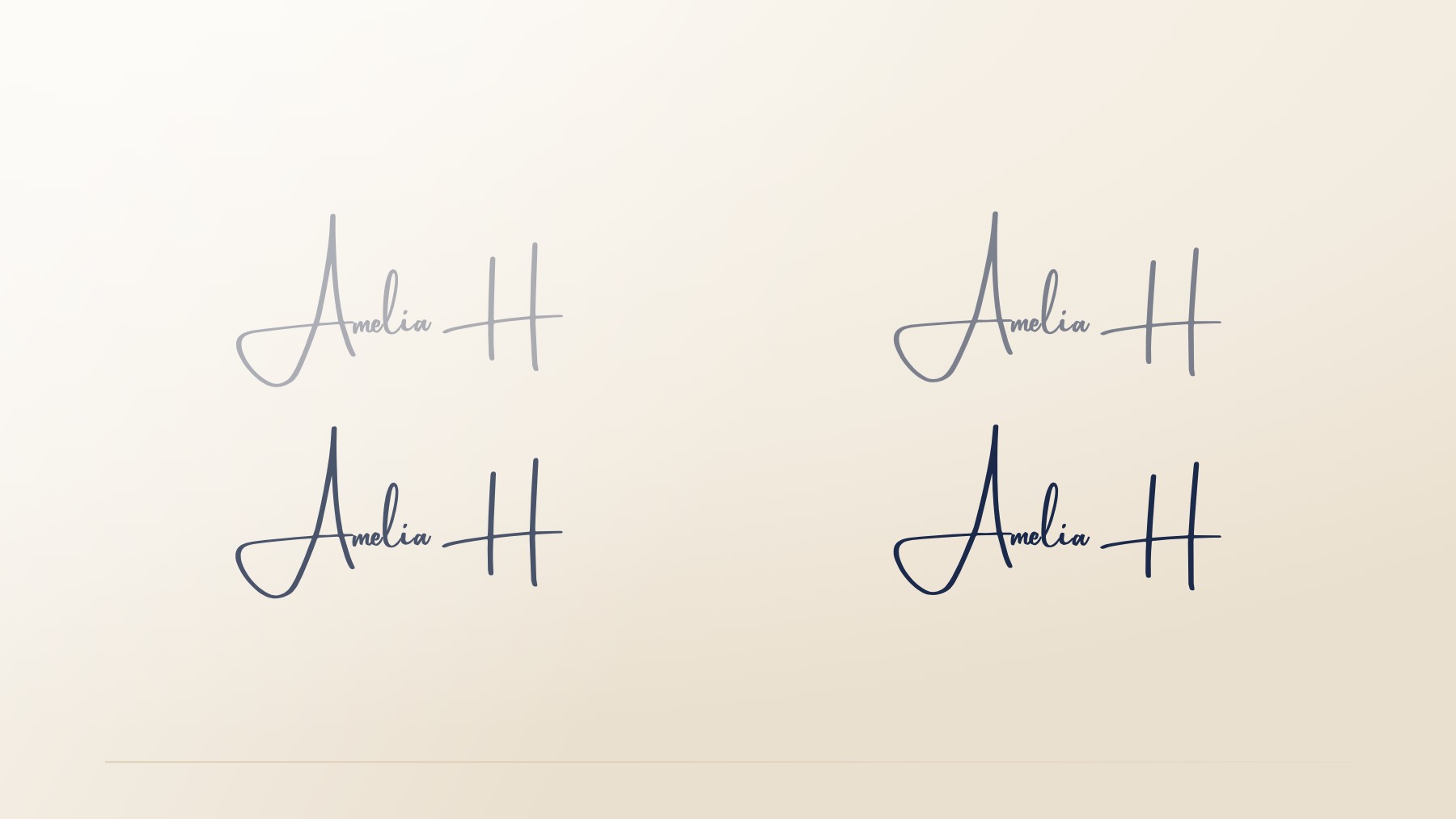
A signature can look beautiful in a screenshot and still fail the only test that matters: can you make it again tomorrow, in a hurry, with an ordinary pen?
The most useful signature is not the most elaborate version of your name. It is the one that keeps its rhythm when real life interrupts. It is recognizable without requiring a performance. It feels personal without becoming precious.
That standard is good news. It means you do not need extraordinary handwriting. You do not need to write in a way that looks borrowed from someone else. You need a few clear choices about structure, movement, and effort—and a signature that makes sense in your own hand.
Start with a useful definition of “good”
A good signature is not a calligraphy sample. It is a practical personal mark.
It should feel like your name, even if it does not spell every letter clearly. It should move with enough ease that you can repeat it. It should hold together at a small size. And it should look appropriate in the places where you actually use it: a client email, a document, a note, a portfolio, a presentation cover, or a quick sign-off on paper.
“Professional” does not have to mean stiff. “Distinctive” does not have to mean complicated. “Readable” does not have to mean printing your name in full. The strongest signatures usually find a balance among all three.
A signature earns its place when it works both on the screen and in the hand.
The right mark is often a little simpler than the one you first imagine. That is not a compromise. It is the point.
The five-part repeatability test
When you compare signature directions, use this practical test. It is not a set of rigid rules; it is a way to notice whether a line will stay useful after the novelty wears off.
| Principle | What it means | Question to ask |
|---|---|---|
| Keep one recognizable anchor | Preserve an initial, letter shape, or gesture that gives the mark a clear sense of identity. | What part makes this unmistakably mine? |
| Let the line move | A signature should have a natural path from beginning to finish. | Can my hand travel through this without stopping to draw? |
| Edit the effort | Remove details you will forget, tire of making, or have to carefully reconstruct. | Could I write this ten times without slowing down? |
| Protect useful clarity | Keep enough structure for the signature to feel connected to your name. | Would this still feel like my name at a smaller size? |
| Finish with purpose | Use a clean endpoint or restrained flourish to make the mark memorable. | Does the finish add character, or only extra work? |
1. Keep one recognizable anchor
A signature does not have to be fully legible. It does, however, benefit from one stable feature that helps it feel like a name rather than a decorative line.
For some people, that anchor is a strong first initial. For others, it is the beginning of a first name, a distinctive loop, or the relationship between first and last name. If you use initials, the anchor may be the way they connect or the shape they make together.
The anchor gives your signature a center of gravity. It means you can simplify other parts without losing the sense that the mark belongs to you.
2. Let the line move
A signature should look written, not assembled.
When a mark is too carefully lettered, each character can feel disconnected from the next. The result may be attractive, but it can also be hard to recreate. A good signature has an internal path: a place where it begins, a movement through the name, and an ending that feels like a natural conclusion.
Try tracing a potential signature in the air. If your hand does not know where it is going next, the design may be asking too much of you. If the movement feels easy, you are likely closer to a line you can own.
3. Edit the effort
The most common signature-design mistake is adding too much.
A long flourish can be beautiful. An extra loop can be charming. A carefully placed underline can feel satisfying. But every decorative decision becomes an instruction you need to remember when you are signing quickly, at a small scale, or without ideal conditions.
Editing the effort does not mean stripping away all personality. It means protecting the details that create character and releasing the ones that create friction.
A useful question is: if this one detail disappeared on a busy day, would the signature still feel like mine? If the answer is yes, the detail may be optional. If the answer is no, it may be the anchor worth keeping.
4. Protect useful clarity
A signature is allowed to be abbreviated. It is allowed to be quick. It is allowed to have a little mystery.
But it should still leave a recognizable structure. This is especially important when the signature will appear in professional contexts or be reduced in size. A mark that turns into a dark tangle when it is small may look less intentional than a simpler line with one clear feature.
Useful clarity is not about making every letter visible. It is about leaving enough of the name—or enough of its rhythm—for the mark to feel grounded.
If you are choosing between a full name, a first name, initials, or a hybrid, consider where the mark will live.
| Direction | Strength | Useful context |
|---|---|---|
| Full name | Feels formal, established, and complete. | Client-facing documents, correspondence, professional services. |
| First name | Feels warm, accessible, and personal. | Creative work, personal notes, community-led brands. |
| Initials | Creates a compact, memorable mark. | Small spaces, visual portfolios, monogram-like use. |
| Hybrid | Balances familiarity with structure. | People who want an expressive first-name gesture with a clear last-name anchor. |
There is no universal winner. The useful choice is the one that fits the contexts you care about most.
5. Finish with purpose
The final movement of a signature can give it a memorable quality. A clean stop can feel composed. A gentle lift can feel open. A restrained flourish can add a little presence.
The key word is restrained.
A flourish should not have to do all the work of making a signature interesting. If the core line lacks shape, adding a larger ending rarely fixes it. If the core line already feels personal, a small finish may be all it needs.
Try the ten-times test
Here is a simple exercise. Take a blank piece of paper and write your current signature ten times without pausing to correct it. Then look at the page as a group, not as ten separate attempts.
What repeats naturally? Is there an initial that shows up consistently? Does the line have a reliable beginning? Is there a finish your hand seems to prefer? Is there a loop, underline, or detail that disappears every other time?
Circle the versions that feel most alive and most familiar. You are not looking for perfect duplicates. Handwriting changes. Pressure shifts. Pace changes. The goal is a stable rhythm—something your hand can recognize even when the individual strokes vary.
Now try the same exercise with a simplified version. Remove one difficult turn. Shorten a flourish. Let one letter connect more naturally to the next. Ten repetitions will tell you more about a signature’s future than one beautiful attempt ever can.
The signature you can repeat is more valuable than the signature you only admire.
A digital direction should leave room for your hand
A digital signature concept can be a helpful starting point. It can show you a structure you had not considered or a balance between letters that feels unexpectedly right. But no generated image should become an impossible standard.
The real success is not whether every handwritten version matches the preview precisely. It is whether the preview gives you a direction you can make your own. The most useful output is a signature with a clear anchor, an intuitive path, a manageable finish, and enough flexibility to feel natural when you use it.
That is why practice belongs in the process. You are not copying artwork. You are building a small habit of self-authorship.
The Worth the Practice Workbook is built for exactly this stage: ruled sheets at the sizes you actually sign at, the stroke order of your own mark, and enough repetitions to get past the version your hand produces when it is still thinking.
Let the right choice get easier over time
A good signature does not become valuable because it is difficult to make. It becomes valuable because it becomes familiar.
Over time, the line settles into your hand. It appears at the close of a note, beneath a proposal, beside a piece of work you are proud of. It becomes recognizable not because it is perfectly controlled, but because it keeps its character.
Choose the version you can return to. That is the one that will feel like yours.
Continue reading: What Signature Psychology Can—and Cannot—Tell You and How to Use a Signature Mark in Your Personal Brand (Without Overdoing It).