The Signature Edit
How to Use Your Signature in an Email Sign-Off
An image signature in your email can look considered or cluttered. Here is how to place a personal mark in a sign-off so it adds warmth without adding noise.
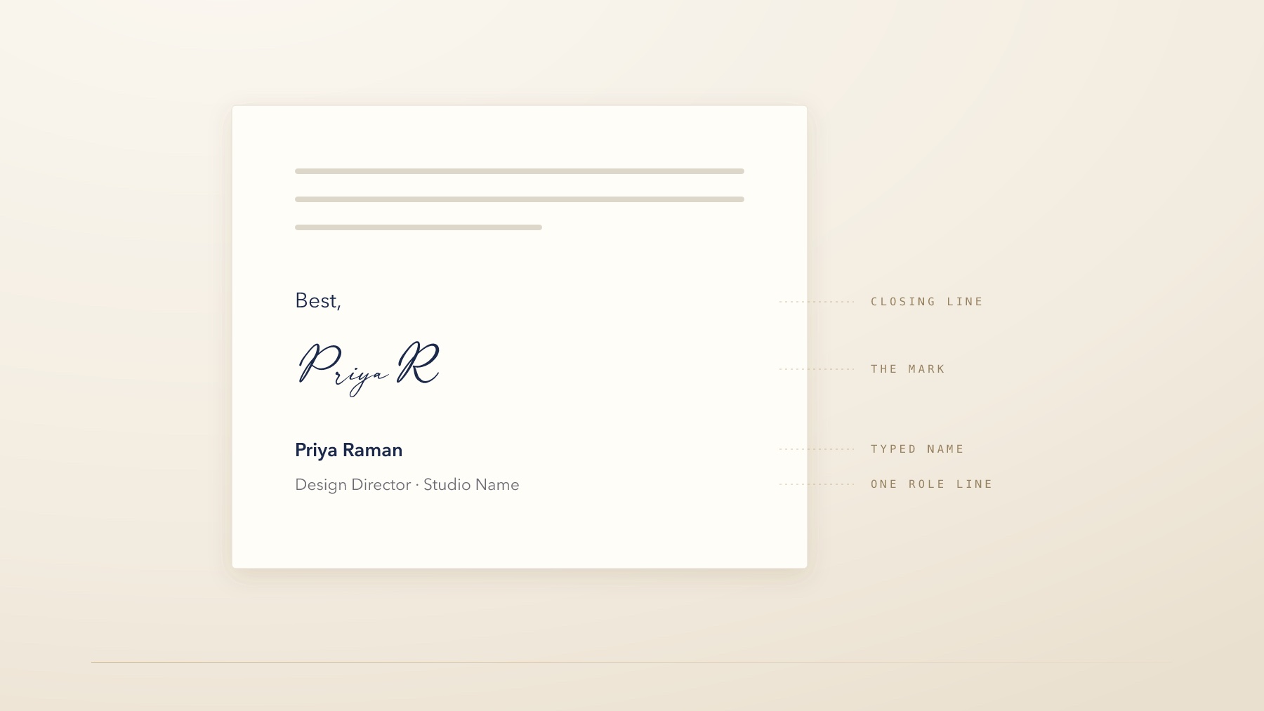
Email is where most people's signature mark will be seen more than anywhere else—and where it most often goes wrong.
The failure is rarely the mark itself. It is the company it keeps. A considered signature placed above a four-line job title, a logo, a phone number, two social icons, a scheduling link, a pronoun line, a confidentiality paragraph and a banner about an upcoming webinar is not a personal touch. It is another element in a crowded footer, and it reads as decoration rather than as a person signing off.
Used well, a signature image does something no typed name can: it makes the end of a message feel like it came from someone. Used badly, it makes an email look like a template. The difference is placement, restraint, and about fifteen minutes of setup.
Decide what the mark is for
Before adding anything, be clear about the job. In an email, a signature image is doing one of two things—and the two want different treatments.
A sign-off. The mark closes the message, in place of or alongside a typed name. It sits directly under the last line of text, at reading scale, and belongs to the message itself.
A footer identifier. The mark sits within your contact block as part of a small personal identity, alongside role and company. It is smaller, more formal, and belongs to the container rather than the message.
Most people want the first and build the second. If you want your email to feel personally signed, the mark needs to be above your contact details, not inside them—close enough to the last sentence that it reads as the end of what you wrote.
A signature placed inside a contact block becomes contact information. Placed under your last sentence, it stays a sign-off.
Placement, size, and weight
| Decision | Recommendation | Why |
|---|---|---|
| Position | Directly below the closing line, above the contact block | Keeps the mark attached to the message rather than the template |
| Display height | Roughly 35–55 px, or about 1.5× your body text height | Large enough to read as a gesture, small enough not to announce itself |
| Export size | 2–3× the display height, transparent PNG | Stays crisp on high-density screens |
| Color | Your ink color, or a dark neutral | Pure black can look pasted on; a deep ink tone reads as written |
| Spacing | A clear line of space above and below | Crowding is what makes a mark look like clip art |
| Alt text | Your name, plainly | The sign-off still works when images are blocked |
The size guidance is the one people most often get wrong in both directions. A mark scaled to the width of the email reads as branding. A mark at 20 pixels reads as a smudge. Between those, at roughly the height of a line and a half of body text, it reads as a signature.
Keep a typed name as well
This is the practical detail that makes the whole thing safe.
Many email clients block remote images by default, and plenty of people read mail in plain-text or accessibility modes where images never appear. If your only sign-off is an image, a meaningful number of recipients see a message that simply stops, or an empty box with a broken-image icon.
The reliable structure, from the top:
- A closing line—Best,
- The signature image
- Your name, typed—Priya Raman
- One role line—Design Director · Studio Name
The image adds warmth for the people who see it. The typed name carries the information for everyone else. Alt text on the image should be your name, so that even the broken state renders something sensible.
Trim what surrounds it
A good signature cannot rescue a heavy footer, but a lighter footer can make an ordinary one look excellent. It is worth auditing what is actually below your sign-off.
Ask of every line: would removing this cost me anything? Most footers contain at least three lines that exist because they were added once and never questioned—a fax number, a second address, an award badge from four years ago, a social icon for an account nobody posts to, a scheduling link duplicated from the line above.
A useful target is your mark, your name, one role line, and at most two ways to reach you. Everything else has to justify itself. Company policy may require a legal or confidentiality notice; where it does, put it last and at a smaller size so it reads as boilerplate rather than as part of your sign-off.
Test it where people read it
Email signatures are built in a settings panel on a laptop and read almost everywhere else. Before you consider the setup finished, send the message to yourself and open it in three places: a phone, a webmail client, and whatever your colleagues use.
Three things tend to surface. The image renders larger on mobile than you intended, because the client scales it to the container rather than to your specified height. The spacing collapses, pushing the mark against the contact block. Or the signature appears with a faint white rectangle behind it, which means the file was exported without transparency.
All three are quick fixes, and all three are invisible from the machine you built it on.
A note on internal mail
There is a reasonable argument for not using an image signature at all inside your own organization. Colleagues know who you are, threads are long, and a repeated image in every reply adds weight to a conversation that does not need it.
Many people set up two profiles: a full sign-off for external mail, and a plain typed name for internal threads and replies. If your client supports it, turning the image off for replies and forwards—keeping it only on new messages—achieves most of the same benefit with less effort.
The instinct to protect is restraint. A mark that appears at the end of a first message feels personal. The same mark appearing eleven times down a reply chain feels like a watermark.
Set it up once, then forget it
Email signatures have a way of accumulating. Something gets added for a campaign, a title changes, a link is pasted in temporarily, and two years later the footer is a small archaeology of past priorities.
The version worth building is the one that survives that. A single mark, a typed name, the minimum that helps someone reach you—and enough space around it that the signature reads as the end of a message from a person.
Then leave it alone. The value of a personal mark comes from consistency, and consistency is mostly a matter of not fiddling.
Continue reading: How to Use a Signature Mark in Your Personal Brand (Without Overdoing It) and Your Signature Is Part of Your Personal Brand—But It Is Not Your Whole Brand. Setting up a work email for the first time? The studio will draw the mark for it: a signature for a first job.